Common mistakes
From a Kissmetrics article: Are You Making These Common Website Navigation Mistakes?
Mistake #1: Non-Standard Style
Visitors expect to find horizontal navigation across the top or vertical navigation down the left side. Putting your navigation in standard places makes your site easier to use.
Mistake #2: Using Generic Labels
Labels like “Products” or “Services” are generic to all businesses and do nothing to communicate with visitors. .. Since your audience isn’t searching for “products” or “services,” navigation with these labels won’t help you rank. Use labels that include popular keyphrases according to the Google Keyword Tool. Pro Tip! The navigation throughout the site and the site’s structure itself should be planned with search engines in mind.
Mistake #3: Drop Down Menus
Drop down menus are bad for two reasons. Depending on how they’re programed, can be difficult for search engines to crawl. But there’s another, bigger reason… Drop down menus are annoying, according to usability studies from the NN Group. This is because as visitors, we move our eyes much faster than we move the mouse. When we move the mouse to a menu item, we’ve already decided to click…and then the drop down gives us more options. It’s a moment of friction in our minds as visitors. Even worse, drop downs encourage visitors to skip important top-level pages. If your site uses drop down menus, you can see the problem right there in your stats: low visits on high pages. Exception: really big “mega drop downs” with lots of options test well in usability studies. If you have a big site with many sections, they may improve usability.
Mistake #4: Too many items in your navigation
With fewer menu items, your visitors’ eyes are less likely may scan past important items. Every time you remove a menu item, the remaining items become more prominent. Challenge yourself to limit your navigation to five items. Pro Tip: This trick also works for the rest of the page, not just the navigation. Every visual element removed makes everything remaining more prominent. You can many anything “louder” by making other things “quieter.” … When your navigation has too many links, less authority and trust passed down to the interior pages. The link juice is diluted. The more concise your navigation, the more home page authority will flow to interior pages, making them more likely to rank. Use the Link Juice Calculator to count the total number of clickable items on your home page. Amazon has around 100 and their site is bigger than yours, right?
Mistake #5: Getting the order wrong
Items that appear first or last on any list are most effective. Navigation is no exception. Psychology studies show that, attention and retention are highest for things that appear at the beginning and at the end. It’s called the “serial position effect,” and it’s based on the principles of primacy and recency. “Contact” should be the last item on the list, putting it at the far right in top-level horizontal navigation, a standard location.
Bonus Reminder! Always links, never buttons
In case you’ve missed the web design trends from the last eight years and you’re still tempted to use graphical, button-based navigation (rather than text-based links) here are five good reasons not to:
- Buttons are not search friendly, since the text within is invisible to search engines.
- Buttons are harder to update than links, requiring Photoshop and a new image for every update.
- Buttons load more slowly that links, making them especially bad for mobile visitors.
- Buttons are less accessible to the visually impaired.
- Buttons are unnecessary, even if you want to use non-standard fonts, thanks to tools like TypeKit.
TL;DR Make the labels descriptive. Limit the number of items to seven. Put the important stuff at the beginning. Avoid drop down menus.
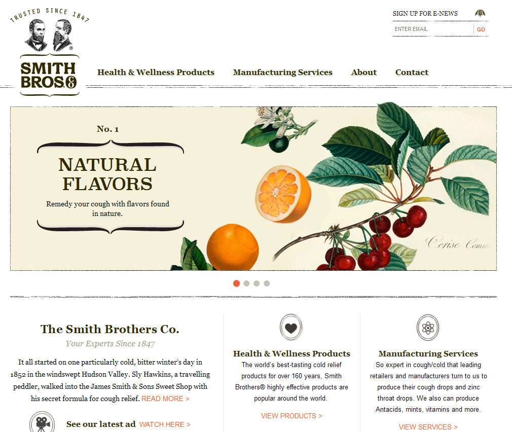
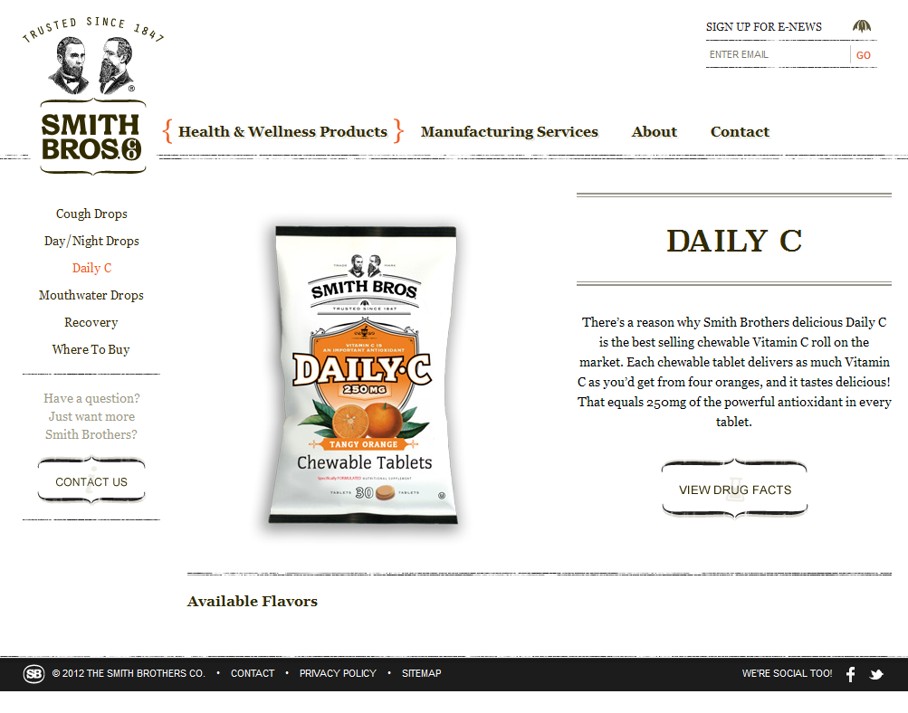
Beautiful Example: http://www.thesmithbrothers.com/
Site Map vs Navigation Map
From: http://toolboxes.flexiblelearning.net.au
The site map (shown below) and the navigation map both provide a hierarchical view of the website and are developed in the early stages of the design process. They provide a means of visualising the content and navigation structures of the website and they facilitate a top down design approach.
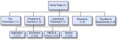
The navigation map provides the same information as the site map but includes information about which pages can be accessed from which locations.
Types of Website Navigation
From: www.webpagemistakes.ca