Probability Theory (For Scientists and Engineers)

Formal probability theory is a rich and complex field of mathematics with a reputation for being confusing if not outright impenetrable. Much of that intimidation, however, is due not to the abstract mathematics but rather how they are employed in practice. In particular, many introductions to probability theory sloppily confound the abstract mathematics with their practical implementations, convoluting what we can calculate in the theory with how we perform those calculations. To make matters even worse, probability theory is used to model a variety of subtlely different systems, which then burdens the already confused mathematics with the distinct and often conflicting philosphical connonations of those applications.
Link to article

HN thread

Berkeley offers its data science course online for free


link to article

HN

The course — Data 8X  (Foundations of Data Science) — covers everything from testing hypotheses, applying statistical inferences, visualizing distributions and drawing conclusions, all while coding in Python and using real-world data sets. One lesson might take economic data from different countries over the years to track global economic growth. The next might use a data set of cell samples to create a classification algorithm that can diagnose breast cancer. (Learn more from a video on the Berkeley data science website.)


Getting Started on Geospatial Analysis with Python GeoJSON and GeoPandas

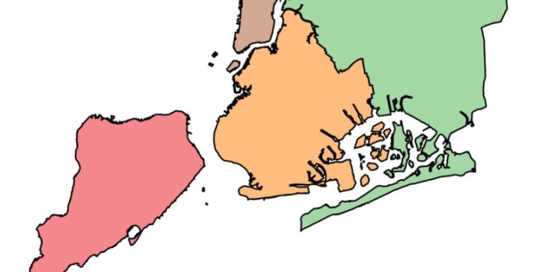
This field is referred to as geospatial analysis. Geospatial analysis applies statistical analysis to data that has geographical or geometrical components. In this tutorial, we’ll use Python to learn the basics of acquiring geospatial data, handling it, and visualizing it. More specifically, we’ll do some interactive visualizations of the United States!

https://www.twilio.com/blog/2017/08/geospatial-analysis-python-geojson-geopandas.html

HN thread

HN comments:

How to Generate FiveThirtyEight Graphs in Python – dataquest.io

If you read data science articles, you may have already stumbled upon FiveThirtyEight’s content. Naturally, you were impressed by their awesome visualizations. You wanted to make your own awesome visualizations and so asked Quora and Reddit how to do it. You received some answers, but they were rather vague. You still can’t get the graphs done yourself.

https://www.dataquest.io/blog/making-538-plots/

HN thread