Hoe werken de verschillende disciplines van vormgeving, techniek en journalistiek samen om tot aansprekende infographics en visuele, digitale verhalen te komen
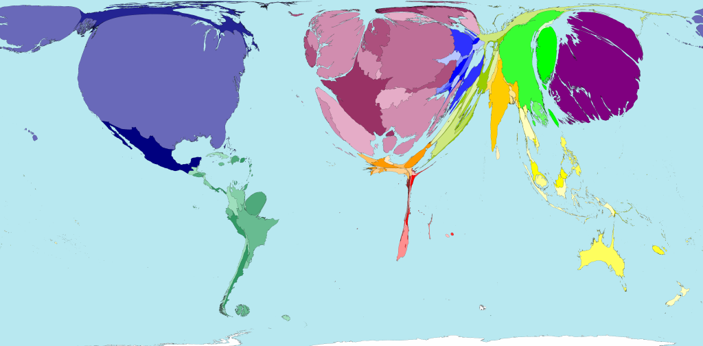
Category: Data Visualization
1914 map of how long it took travel to different places from London.
Bartholomew, J. G. (John George); Lyde, Lionel William: An atlas of economic geography. 1914.
View/download the complete atlas here.
Interactive JavaScript charts for your webpage | Highcharts
Saw http://tool.globalcalculator.org/ using this:
Highcharts – Interactive JavaScript charts for your web pages.
Source: Interactive JavaScript charts for your webpage | Highcharts
Data set sources
- http://www.stat.ncsu.edu/research/sas/sicl/data/
A large collection of small data sets for the book ‘A Handbook of small data sets (Hand)’ - http://www.statsci.org/datasets.html
Data sets and links on StatSci

8 great books about data visualisation | Tableau Software
Do you want to learn more about data visualisation and why Tableau behaves the way it does? Do you want to be able to create more effective visualisations? Or are you interested in the history of data visualisation? These are all great topics and knowing more about the topic will improve your use of Tableau. Here is a list of books I have read and found extremely useful over the last few years. This is far from a definitive list; there are many many more.
Source: 8 great books about data visualisation | Tableau Software
Beyond Tufte — Nine Great Books about Information Visualization
Nine Great Books about Information Visualization
Source: Beyond Tufte — Medium