Steve Krug’s ‘Don’t make me think’ is a classic in the world of web design. I recently pulled the 2006 print from my book shelf to give it a (first) read. And it was worth it!
This is what stayed with me the most (ordered by chapter):
-
Don’t make me think
– Remove as much as possible the ‘question marks’ (Where am I, Where can I find, What does this mean
– Make things self-evident, or if this is not possible, self-explanatory -
How we really use the web
– We don’t read, we scan. (I like this analogy: web users tend to act like sharks: they have to keep moving or they’ll die)
– We satisfice (choose the first reasonable option)
– We muddle through
-
Billboard Design 101
Five important things to make your site understandable:
– Clear visual Hierarchy
– Take advantage of Conventions
– Break pages up in clearly defined areas
– Make obvious what is clickable
– Minimize noise (busy-ness, background noise) -
Why users like mindless choices
Making the choices mindless is one of the main things that make a site easy to use.
-
Omit needless words
Happy talk must die. Instructions must die
-
Designing Navigation
What makes browsing a website different from navigating a tool store?
– No sense of scale
– No sense of direction
– No sense of locationThe Home Page is like the North Star, a fixed point to base your navigation on.
Purposes of Navigation:
1. Help us find what we are looking for
2. Tell us where we are
3. It gives us ‘ground under our feet’
4. It tells us what is there – Navigation reveals content!
5. It tells us how to use the site – where to begin, what are your options
6. It gives us confidence in the people who built itPersistent Navigation (or Global Navigation)
Should include the five most important elements:
– Site ID
– A way Home
– A way to search
– Utilities (help to use the site; give information about the publisher)
about us, archives, contact us, company info, help, news, search, site map
– Sections (the primary Navigation)Secondary, tertiary etc. navigation
Don’t forget to design the lower levels of navigation! It is importantPage Names
Driving in L.A. is fun because the street signs are big, and they are in the right place.Four things about page names to keep in mind:
– Every page needs a name
– The name needs to be in the right place
– The name needs to be prominent
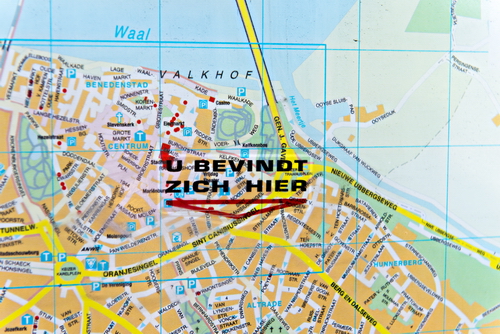
– The name needs to match what I clicked (or match as closely as possible)‘You are here’
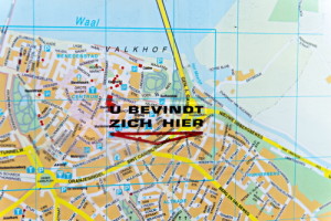
– Highlights, indicators, bold text ..
– Clearly visible!Breadcrumbs
– Show the path from the home page to where you are.
– For most sites breadcrumbs alone are not a good navigation scheme. They are not a replacement for showing at least the top two layers of the hierarchy
– Put them at the top
– Use > between levels
– Boldface the last item
– Don’t use instead of page namesThe Trunk Test
Imagine you’ve been blindfolded and locked in the trunk of a car, and then dropped somewhere in the deep bowels of the website. Can you answer the following questions?
– What site is this?
– What page am I on?
– What are the major sections of the site?
– What are my options at this level?
– Where am I in the scheme of thing? (‘you are here’
– How can I search?Why is his important? Don’t forget that visitors often do not enter your website through you home page!
B.t.w. The trunk test is done on printed screenshots where you circle the items mentioned above as fast as possible. -
Designing the Home Page
‘The Home page is beyond your control’
Think about al the things your home page has to accommodate:
– Site identity and mission
– Site Hierarchy
– Search
– Teases of the good stuff inside
– Timely content (show that the page is alive)
– (Deals)
– Shortcuts to the most requested pieces of content
– RegistrationAnd the more abstract objectives:
– Show me what I am looking for
– .. and what I am not looking for
– Show me where to start
– Establish credibility and trustAnd then the conditions and constraints:
– Everybody wants a piece of it
– To many cooks (too many opinions)
– One size fits allThe first casualty of war
Designing a home page inevitably involves compromises.
But the one thing you can’t afford to loose is conveying the big picture
– What is this?
– What do they have here?
– What can I do here?
– Why should I be here (and not somewhere else)?How to get the message across
Two important places where we expect to find explicit statements of what the site is about:
– The tagline – right next to the site id. Make sure it is good!
– The welcome blurb – a prominent block on the home page, visible without scrollingGuidelines for getting the message across:
– Use as much space as necessary – Don’t sacrifice your message. But also don’t use more space than needed.
– Don’t use a mission statement as welcome blurb – nobody reads your corporate mission statements
– It is one of the most important things to testTaglines
– Good: clear an informative. Bad: vague
– Good: just long enough
– Good: convey differentiation and a clear benefit. Bad: generic
– Good: personable, lively, sometimes cleverThe fifth question: Where do I start?
– if I want to search
– if I want to browse
– if I want to sample the best stuffHome page navigation can be unique
It can be different, but not too different.
– Section descriptions You may want to describe the main sections on the home page
– Different orientation – horizontal vs vertical may be necessary
– More space for identity – The site ID is usually larger on the home page, and there is a tag line (not needed on every page probably)But users have to recognize that the Home page navigation and the persistent navigation are two versions of the same thing. This means: same section names, same order, same grouping. Mostly same visual cues.
- Design teams and usability…
- Usability testing…