Just found out about RFS and it sounds really handy.
Responsive Font Size (RFS) is an engine that automatically calculates and updates the font-size property on elements based on the dimensions of the browser viewport.
It’s compatible with Sass, Less, Stylus and PostCSS, so it plugs into just about any stack. You can compile Bootstrap 4 with it too simply by changing $enable-responsive-font-sizes to true (see below). In BS5 this will be enabled by default. See this CSS Tricks article.
How does it work?

Let’s focus on the black line. As you can see it is the biggest font size of the bunch with a maximum of 60px and a minimum of around 24px. Notice also that it will always be slightly bigger than the other font sizes even on a very small screen.
Including a font-size is simple:
.scss syntax:
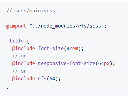
The value you pass to the mixin is the maximum size of the element which. The maximum size will be applied when the viewport is 1200px is wider.
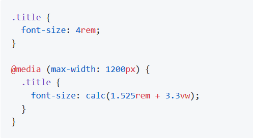
The Generated CSS:
If you are interested in how it works: it’s just a bit of math
Good to know
- RFS only applies to font sizes above the base font size ($rfs-base-font-size in scss/sass) which is 1.25rem (20px in most browser configurations) out of the box. Everything below that size (e.g. normal body text) will not be managed by RFS.
- The output font size will be rendered in rem. You can change it to
px(see configuration on Github) but it will disable the ability for users to change the the font size in their browser.
Configuration
RFS works out of the box without any configuration tweaks, but if you feel the urge to go loco and fine tune the way font sizes are rescaled, you can.
The most important settings:
Base font size (unit in px or rem)
SCSS, Sass & Stylus: $rfs-base-font-size
The option will prevent the font size from becoming too small on smaller screens. If the font size which is passed to RFS is smaller than this base font size, no fluid font rescaling will take place.
Default value: 1.25rem
Breakpoint (in px, em or rem)
SCSS, Sass & Stylus: $rfs-breakpoint
Above this breakpoint, the font size will be equal to the font size you passed to RFS; below the breakpoint, the font size will dynamically scale.
Default value: 1200px
Factor (number)
SCSS, Sass & Stylus: $rfs-factor
This value determines the strength of font size resizing. The higher the factor, the less difference there is between font sizes on small screens. The lower the factor, the less influence RFS has, which results in bigger font sizes for small screens. The factor must me greater than 1.
Default value: 10
Class (boolean)
SCSS, Sass & Stylus: $rfs-class
RFS can be enabled or disabled with a class. There are 3 options:
falseNo extra classes are generated.disableWhen the the disable classes are generated you can add the.disable-responsive-font-sizeclass to an element to disable responsive font sizes for the element and its child elements.enableRFS is disabled by default in this case. The.enable-responsive-font-sizeclass can be added to an element to enable responsive font sizes for the element and its child elements.
Default value: false
Safari iframe resize bug fix (boolean)
SCSS, Sass & Stylus: $rfs-safari-iframe-resize-bug-fix
Safari doesn’t resize its font size in an iframe if the iframe is resized. To fix this min-width: 0vw can be added and that’s what happens if this option is enabled. See #14.
Default value: false
!important usage
By setting a second parameter to true, !important is added after the font-size value. (Example is in scss)
.label {
  @include responsive-font-size(2.5rem, true);
}
CSS:
.label {
  font-size: 2.5rem !important;
}

@media (max-width: 1200px) {
  .label {
    font-size: calc(1.375rem + 1.5vw) !important;
  }
}
Best practices
- Don’t set RFS on the
htmlelement, because this influences the value ofremand could lead to unexpected results. - Always set your line-heights relative (in
emor unitless) to prevent interline issues.
Installation
RFS can be installed using a package manager (recommended):
- npm:
npm install rfs - yarn:
yarn add rfs - bower (deprecated):
bower install rfs --save
If you’re using Webpack, you can simplify the @import using the ~ prefix:
@import "~rfs/scss";Responsive font sizes in Bootstrap 4
Bootstrap v4.3 ships with the option to enable responsive font sizes,
allowing text to scale more naturally across device and viewport sizes.
RFS can be enabled by changing the $enable-responsive-font-sizes Sass variable to true and recompiling Bootstrap.
To support RFS, we use a Sass mixin to replace our normal font-size properties. Responsive font sizes will be compiled into calc() functions with a mix of rem and viewport units to enable the responsive scaling behavior. More about RFS and its configuration can be found on its GitHub repository.